Behind the Design
Amalfi Colorwork
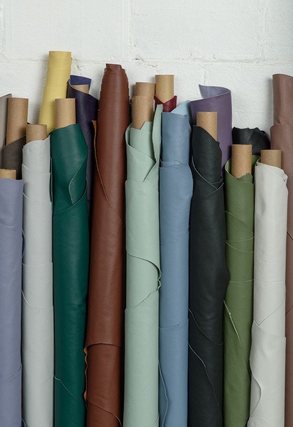
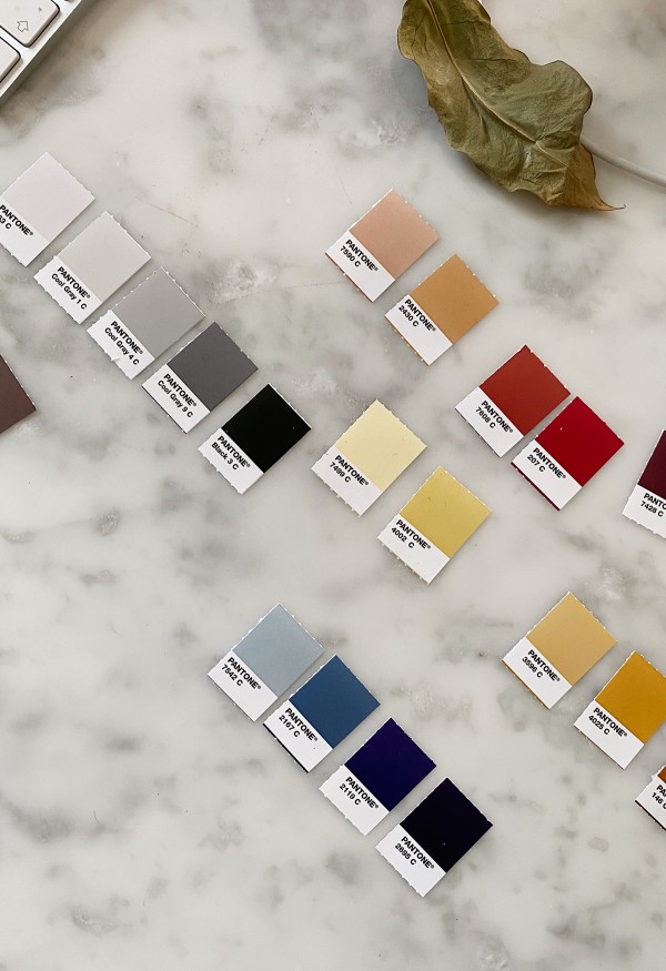
In 2021, Copenhagen-based designer and trend-forecaster Nina Bruun partnered with FilzFelt to expand and refresh their 100% Wool Design Felt color palette. Working from their existing colors, Nina developed a scheme of ninety-six colors, looking to hues found in nature and her surroundings in Copenhagen for inspiration. This year, Spinneybeck was thrilled to partner with Nina to develop a color line for the Amalfi upholstery leather collection.
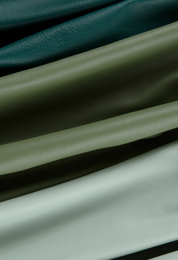
Turning again to objects found in nature and the nordic light that continually inspires her work, Nina tackled this vastly different material with the same thoughtful approach, curating a color palette that allows the material’s inherent qualities to shine while balancing a mix of timeless and trending colors.
Nina walks us through the process of developing a cohesive color palette, shares the natural objects from her life-long collection that shaped the palette, and the color trends she sees on the horizon.
Last year, you expanded the color palette for FilzFelt. This year, you tackled colorwork for Spinneybeck’s leather! How was your approach to leather different from that of wool felt?
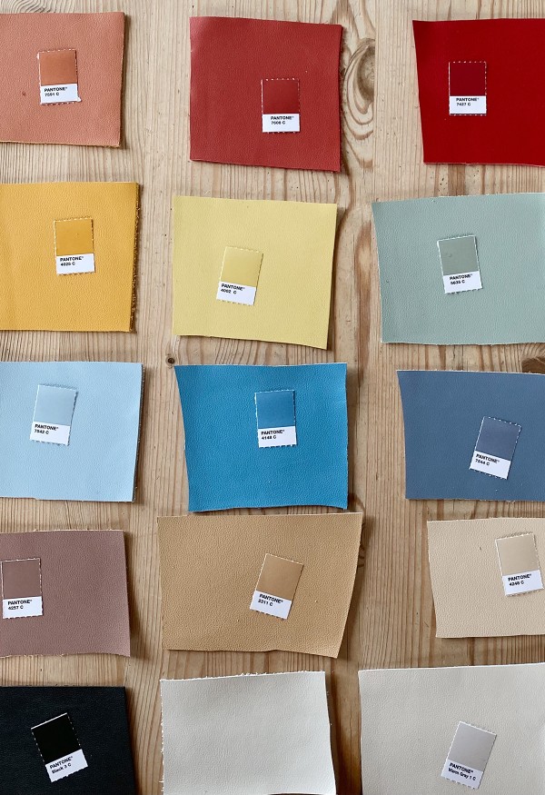
While creating this new collection, it was important to keep in mind that the colors come out more saturated on leather than on felt, so my sources of inspiration and choices were different. I looked at more shiny surfaces and materials with a sheen while collecting inspiration.
What were the challenges with this particular material? What were the advantages?
Leather can be challenging to color. It has a rich surface and varying material depths. As a result, it can look very artificial or synthetic if the tone is not right. On the other hand, however, the result can be magical if the color is just right. The most significant advantage was creating a full collection from start to finish – that gave me some freedom regarding the result.
Where did you look for inspiration when you started? How was it different from the starting point for the FilzFelt colorwork?
First, this project involved designing a full collection with no existing colors to build on. That put me at a very different starting point for this project. I initiated the collection by researching what a cohesive leather palette should contain in 2022.
In my research for this collection, I looked at current trends and the colors that are growing in popularity. With that in mind, I created the collection to be relevant in time now and in the future. I also aimed to create a collection that would meet the needs of architects, users, and designers – colors to be implemented and used on large surfaces, which have high demands in themselves.
Like the FilzFelt colorwork, I looked to nature for inspiration as leather is a natural material itself. I did a lot of the colorwork in the most northern part of Denmark, an area known for its picturesque scenery and light. It’s a place that painters and artists have been drawn to for many years. The Skagen painters, in particular, are famous for their work in the area.
What feelings do you want these colors to elicit and bring to a space?
I want this collection to be a tool that can create a broad spectrum of atmospheres and feelings, depending on how you combine and use them. I hope these colors can inspire to create many new universes and atmospheres.
“While creating this new collection, it was important to keep in mind that the colors come out more saturated on leather than on felt, so my sources of inspiration and choices were different. I looked at more shiny surfaces and materials with a sheen while collecting inspiration.”
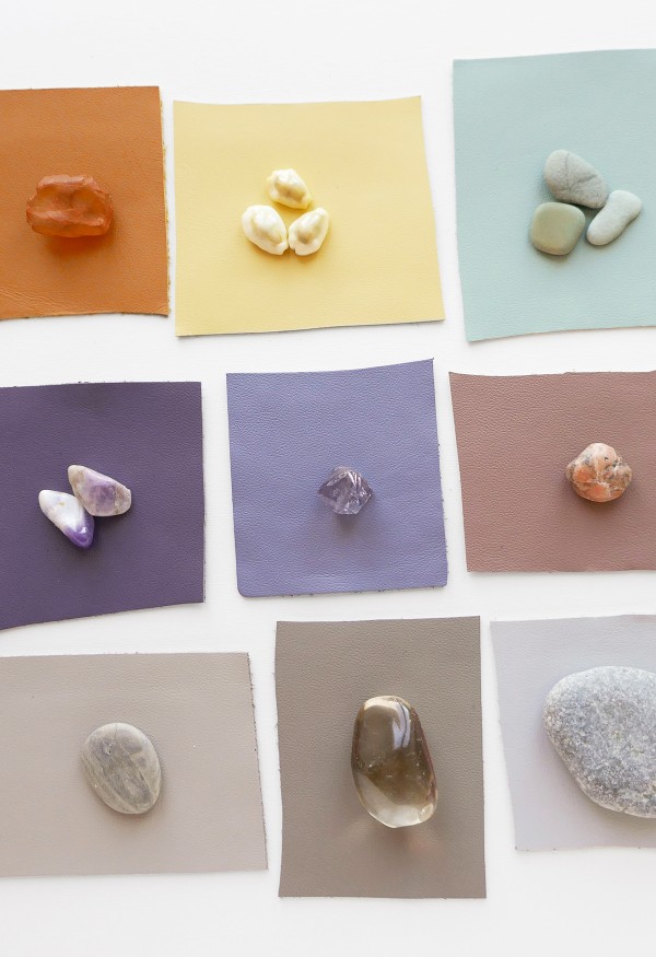
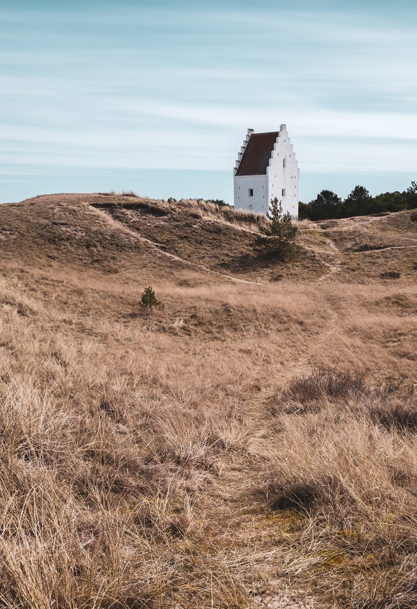
“I did a lot of the colorwork in the most northern part of Denmark, an area known for its picturesque scenery and light. It’s a place that painters and artists have been drawn to for many years. The Skagen painters, in particular, are famous for their work in the area.”
Can you touch on the challenge of balancing timeless colors vs. trend colors? Does this particular material have any specific impact on this approach?
I’m a firm believer in long-lasting palettes. When working with materials used in interiors or architecture, it’s extremely important that the colors live for a very long time. I’ve curated a collection with a thoughtful and intentional range of neutral colors and vibrant hues that consider both timeless and more trend-focused colors.
What colors do you predict will trend this/next year? Are there any color trends happening now that you find surprising?
I think people are seeking colors that spark optimism, light, and positivity. Purple has become a continually prominent color, for example. Not surprising, but I find it fascinating that we (still) see so many digital-inspired colors – colors you can find in all of the devices we surround ourselves with and play a massive role in our everyday life. Think of colors often used in association with mobile phones, computers, and voice-controlled units in the home – colors like turquoise, purple, blue, light blue, and pink.
Leather has a wide range of applications, from architecture and furniture to smaller home goods and accessories - how did this inform your approach to a color palette?
I’m very focused on the fact that we, as humans, tend to be drawn to specific colors and often buy the same colors over and over again, regardless of time or trends. So it was important to combine these popular timeless colors alongside the more characteristic colors that can add these pops of colors. Hopefully, that inspires some to create room for the beautiful use of leather in many scales.
Can you speak a little about the importance of working with natural materials and how sustainability informs your approach to design?
I know it is top of mind for many in these times, but it cannot be said enough that we owe it to our surroundings and future generations to think about sustainability. I would say that sustainability doesn’t drive my projects, but rather, I steer my projects towards sustainability. I prefer that my projects have a sustainable angle before I start.
What other natural materials have you worked with recently that have sparked your interest? Are there others you’re curious to work with in the future?
At the moment, I am working with paper – in a sculptural manner. It’s very satisfying, and I’m excited about the process and result. I’m always ready for a good challenge – the most satisfying thing about my work is the opportunity to get wiser on a range of materials and learn about new ones.
Since the end use of this leather, in particular, is so unique, being a water-resistant/soft hand/compared to Acqua leather-did this factor in the colorwork at all?
No, not really, but I did include Acqua in my research for comparison. For a project like this, it’s important for me to create a unique palette within the Spinneybeck family of products, and at the same time, it has to have a space and belonging within the range/collection.
“Amalfi is a nature-inspired collection with a beautiful and rich surface structure that I hope inspires a versatile array of end uses and color combinations.”
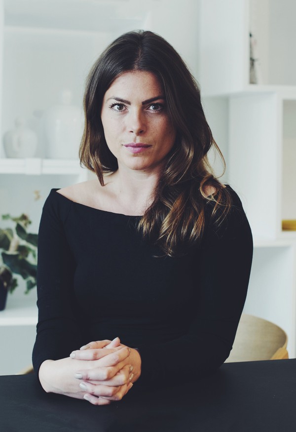
About Nina Bruun
Nina Bruun is an accomplished designer, trend spotter, and consultant based in Copenhagen, Denmark. In 2016, Nina started a multidisciplinary creative consultancy where she and her team create customized solutions in trends, colors, product design, and visual brand identity.